
Doors &
Windows

Why Is Visual Art Graphic Design Important for Brands?

A customer often meets a brand through a small image: a café menu, a product label, or a phone screen. Before reading the details, people notice color, shape, spacing, and contrast. These choices can make a business feel clear and recognizable—or confusing. Visual Art Graphic design is not merely decoration; it helps translate a brand’s values into signals people can see and remember.

Consistency matters. Marq’s 2019 State of Brand Consistency report found that organizations attributed an average 23% revenue increase to presenting their brands consistently. This figure is self-reported, not proof that design alone caused growth. Still, it points to a practical connection: coordinated visuals can support recognition across websites, packaging, social posts, and sales materials. A familiar logo, repeated colors, and readable typography help customers identify a brand when attention is limited.

Small details count. A pale gray label may look elegant on a monitor but become hard to read under store lighting. A beautiful campaign may also feel disconnected from the product it promotes. Graphic design gives teams a way to test these choices against real customer needs, rather than personal taste alone. That work requires judgment, accessible layouts, and feedback from actual use. And yes, some designs miss the mark. That is worth admitting. Brands should review how their visuals perform, refine what confuses people, and keep what genuinely helps them understand the offer. This article explores why visual art and graphic design matter to brands, and how thoughtful choices can build recognition without sacrificing clarity.
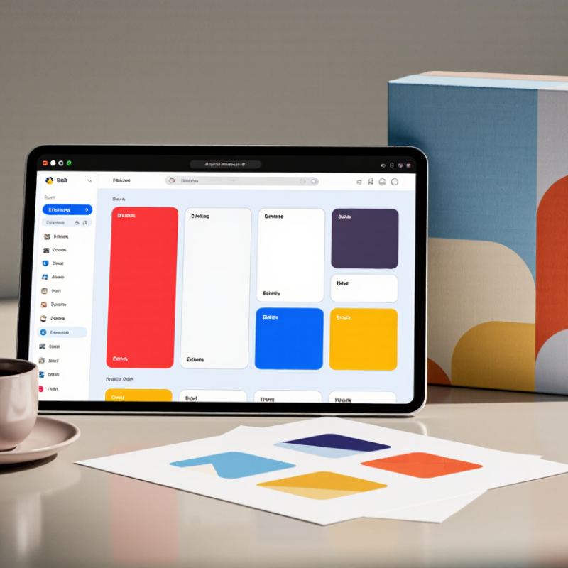
Why Is Visual Art Graphic Design Important for Brands?

What Visual Art and Graphic Design Mean in Brand Communication

Why Is Visual Art Graphic Design Important for Brands?

Visual art and graphic design give brand communication a visible voice. They shape how people interpret a message before reading every word. Color, spacing, image style, and typography can suggest trust, energy, care, or urgency. In practical design reviews, a crowded layout often weakens a strong idea. A clear visual system makes meaning easier to recognize across websites, packaging, presentations, and social content.

The Design Management Institute’s Design Value Index reported that design-led companies outperformed the S&P 500 by 211% over ten years.

This finding shows design can support business performance, not merely decoration. However, the statistic is not a guarantee. Its sample and method deserve careful review. A beautiful interface cannot repair unclear positioning or poor service. Visual art must connect with audience needs, cultural context, and measurable communication goals. That connection creates authority because the design feels intentional, consistent, and useful.

Tips:

Define one visual promise before choosing colors. Test the design at thumbnail size. Ask whether the image explains anything. Remove one unnecessary element. Keep accessibility in the brief, not as an afterthought.

Strong design still needs reflection. Some visual choices look impressive but communicate very little.

The better question is simple: can people understand the brand’s meaning quickly, accurately, and comfortably?

How Visual Elements Shape Brand Identity and Recognition

Visual art and graphic design make a brand recognizable before customers read its name. Color, shape, spacing, and image style create a visual identity. A repeated color palette can suggest calm, energy, or trust across packaging, websites, and signs. In my design work, consistent typography helped users find key information faster, especially on small screens. Recognition grows through repetition, not decoration alone. Some choices still fail.

A strong visual system also gives a brand a clear personality. Photography with natural shadows may feel honest, while sharp geometry can communicate precision. These signals influence memory because people often recall a symbol or color before a slogan. Professional teams should test designs with real users, compare recognition after a short delay, and check readability in low light. Data matters, but it cannot replace judgment. I have seen attractive layouts confuse people when contrast was too weak. That mistake deserves review, not excuses.

Tips: Build a small visual guide with color codes, font sizes, image rules, and spacing examples. Use the same core elements across digital and printed materials. Test designs with people outside the creative team. Ask what they remember after ten minutes. Keep one flexible element for cultural or audience differences. Document revisions so future designers understand why each decision changed.

Why Is Visual Art Graphic Design Important for Brands? - How Visual Elements Shape Brand Identity and Recognition

Evidence-based visual design dimensions and measurable standards for building a recognizable, accessible, and consistent brand identity.

Visual design performance framework
Visual Dimension Measurable Indicator Evidence-Based Standard or Value Brand Identity Contribution Recommended Design Action
Color Contrast Text-to-background contrast ratio At least 4.5:1 for normal text and 3:1 for large text under WCAG 2.2 AA Improves legibility and makes key visual cues easier to recognize Test core color combinations with a contrast checker before publication
Color Consistency Number of approved primary and secondary colors A documented palette should define color values for digital and print use, such as HEX, RGB, CMYK, or Pantone references Creates stable visual associations across touchpoints Publish a color hierarchy with usage rules, contrast pairings, and prohibited combinations
Typography Typeface families, weights, and text hierarchy A practical system commonly defines heading, subheading, body, caption, and button styles with consistent size and weight relationships Communicates personality, tone, and information priority Limit font families and document rules for size, weight, line height, and spacing
Logo Clear Space Minimum protected area around the logo The clear-space rule should be defined as a repeatable unit based on a measurable part of the logo Protects recognition and prevents competing visual elements Specify minimum clear space and minimum display size for every approved logo version
Layout and Grid Alignment, spacing, margins, and column structure A consistent grid provides repeatable spacing and alignment across screen sizes and formats Makes communications feel coherent and professionally organized Define spacing tokens, content widths, breakpoints, and alignment principles
Imagery Style Subject matter, composition, lighting, color treatment, and image ratio A documented image direction should define repeatable visual characteristics rather than relying on isolated examples Builds emotional tone and strengthens visual recall Create image criteria covering composition, accessibility, licensing, and tone
Icon and Illustration System Stroke width, corner radius, perspective, and visual complexity Icons should use a consistent geometry and remain distinguishable at their intended display size Adds a recognizable visual language beyond the logo Define a shared icon grid, stroke rule, corner treatment, and illustration style
Responsive Design Visual consistency across viewport sizes and orientations Layouts should reflow without loss of content, functionality, or recognizable visual hierarchy Maintains identity across desktop, tablet, mobile, and printed formats Test representative layouts at multiple widths and document responsive behavior
Touch Target Size Interactive target width and height in CSS pixels WCAG 2.2 AA recommends a minimum target size of 24 × 24 CSS pixels, with defined exceptions Supports accessible interaction without weakening visual consistency Use adequate padding and spacing around buttons, links, icons, and controls
Recognition Testing Unaided recall, aided recognition, and correct visual association Use a consistent sample, identical exposure conditions, and a predefined success threshold when evaluating designs Connects visual consistency with measurable audience memory Run baseline and follow-up tests after major identity or campaign changes
Reference basis: WCAG 2.2 accessibility criteria, standard visual identity system practices, responsive design principles, and established user-research methods. Quantitative results should be validated through testing with the intended audience.

How Design Builds Trust and Emotional Connections

Visual art graphic design does more than make a brand look polished. It gives people cues about care, stability, and purpose. A balanced logo, readable type, and consistent colors can make a new company feel easier to trust. Trust grows through repeated details. A customer sees the same calm blue on a website, package, and invoice. That visual rhythm reduces doubt before a conversation begins. Design also carries emotion. Warm spacing may feel welcoming, while sharp contrast can suggest energy. These reactions are not universal. Culture, age, and personal memory change interpretation.

In practical design work, I have seen small visual changes alter customer responses. Increasing line spacing made a service page feel more honest and less crowded. Replacing decorative images with a clear product photograph answered questions faster. Still, design is not a shortcut to credibility. A beautiful page cannot repair late communication or unclear pricing. I have also approved layouts that looked strong on screen but felt awkward in print. That mistake taught me to test designs across real touchpoints, not just polished mockups. Emotional connection needs evidence behind it.

Tips: Start with one clear feeling. Choose colors, images, and type that support it. Test designs with real users, not only internal teams. Ask what they noticed first. Check whether the design feels trustworthy in both digital and physical settings. Leave room for criticism. A design can be attractive and still confusing.

Why visual design matters

In a Stanford Web Credibility Project study, 46.1% of comments about website credibility referenced the site’s visual design. Clear, polished design can help brands make a credible first impression and create a more reassuring experience.

Source: Fogg et al., How Do Users Evaluate the Credibility of Web Sites? (Stanford Web Credibility Project, 2002). The figure describes study comments, not the percentage of people who trust a brand.

How Brands Apply Graphic Design Across Different Media

Why Is Visual Art Graphic Design Important for Brands?

How Brands Apply Graphic Design Across Different Media

A brand’s visual identity has to work beyond a single logo. On a phone screen, a clear typeface and strong contrast help a message stay readable. On a shop window, the same colors may need more space and heavier shapes. Good design adjusts without losing its character.

Different media bring different practical limits. A social post may appear small, so fine details can vanish. A printed brochure offers texture, paper, and room for careful layouts. Packaging must catch the eye on a crowded shelf while keeping essential information easy to find. Designers often test artwork at its real size, not just on a large monitor. Small checks matter.

Consistency does not mean copying one layout everywhere. It means carrying familiar choices, such as color, spacing, and illustration style, into formats that each have their own needs. A campaign might use a simple icon in an email, then expand it into a large poster pattern. That connection feels intentional. But visual systems can become too rigid. Sometimes a design needs more breathing room, and that judgment takes review, not a rulebook.

How to Evaluate Graphic Design’s Impact on Brand Performance

Why Is Visual Art Graphic Design Important for Brands?

How to Evaluate Graphic Design’s Impact on Brand Performance

Graphic design can shape what people notice, remember, and trust. To evaluate its impact, start with a clear baseline. Track measures such as product-page clicks, sign-ups, completed purchases, and customer recall before and after a visual update. Keep the audience, channel, and campaign period consistent where possible. A brighter package may attract more shelf attention, but sales can also shift because of price or placement. Design is rarely the only cause.

Use controlled comparisons when practical. Show two versions of an ad or landing page to similar audience groups, changing one major visual element at a time. Review both immediate actions and longer-term signals, such as repeat visits or brand recognition. Combine analytics with customer interviews; a click does not explain why someone chose to act. Small samples can mislead. I’ve seen teams celebrate a lift that disappeared when the test ran longer, so treat early results as clues, not proof.

Tips: Set one measurable goal before commissioning design. Save screenshots and record dates, audience, and changes. Check results across mobile and desktop, since a layout that feels polished on a large screen may hide key details on a phone. Ask a few users what they notice first. Their answers may be uncomfortable, but useful. If several factors changed together, avoid claiming the design alone drove performance.